Hospital Page (2026)
Using experimentation, analytics, and behavioural insights to improve conversion and user experience
Using experimentation, analytics, and behavioural insights to improve conversion and user experience
This project focused on redesigning a high-traffic hospital landing page at Nuffield Health — often the first step in a patient’s private healthcare journey.
The page needed to balance:
Trust-building
Medical reassurance
Information discovery
Commercial conversion
Previous A/B tests, surveys, and analytics showed the page was too conversion-focused, and not aligned with how patients actually make decisions.
The opportunity was to transform the page from a single-path funnel into a multi-path decision-support experience.
The original page:
Pushed users toward one primary conversion goal
Buried Nuffield’s strongest USPs & credibility signals
Offered limited onward journeys
Under-served users in research or consideration mode
Result: Users weren’t rejecting the brand — they were uncertain about next steps or not ready to commit yet.
If we redesign the page using behavioural data, clearer messaging, stronger unique selling point (USP) surfacing, and more flexible onward journeys, users will find the right information faster, feel more confident, and show stronger engagement and conversion.
The goal wasn’t just more conversions — but better decision quality.
We grounded decisions in multiple insight streams:

Data revealed a significant drop-off below the header, as users skipped content and went straight to Find Your Hospital. The change focused on improving engagement and UX alignment.
Adobe Analytics conversion & drop-off data
Funnel progression & scroll depth
Downstream journey tracking
On-page poll responses
Patient survey feedback
Previous A/B test learnings
Microsoft Clarity heatmaps & session replays
Hesitation, rage-clicks, and abandonment signals
Users landing on this page fall into different intent stages:
Ready to book
Comparing providers
Seeking reassurance
Still understanding their condition
A single-path experience could not serve all of them effectively.
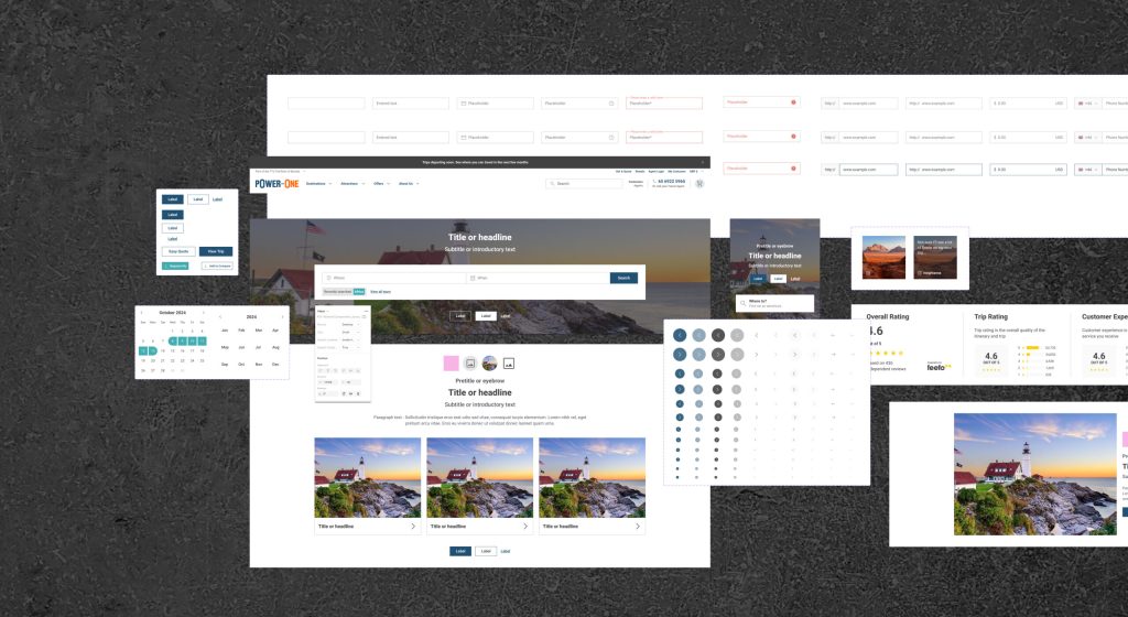
I created four wireframe concepts:
3 concepts aligned to the existing Design System & CMS constraints
1 blue-sky concept to explore future opportunities
This ensured we balanced real-world delivery feasibility with innovation.
Worked closely with:
UX & Content
SEO
Product
Engineering
Together, we shortlisted concepts, built them in CMS, and refined into test-ready UI variants.

Designed for:
High-intent users
Faster enquiry completion
Shorter decision cycles
Designed for:
Research-mode users
Reassurance & education
Reduced friction
Stronger onward journey discovery
FAQ inclusion to reduce uncertainty
USP prominence & framing
Location content placement (higher vs lower)
Onward journey link hierarchy
Control vs Variant testing
Minimum test duration: 1 month
High traffic ensured statistical confidence
Performance tracked across:
Conversion rate
Engagement & interaction
Scroll depth
Next-page journey behaviour
Early results showed a short-term dip, but rather than reacting prematurely, we extended the test by 4 weeks — prioritising data integrity over gut reaction.
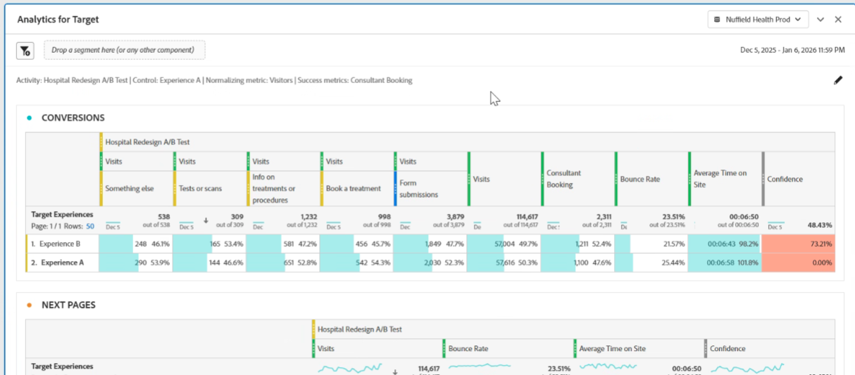
Hospital Redesign A-B Test
The redesigned Variant demonstrated:
Increased engagement with onward journeys
Higher interaction with USP & trust content
Improved scroll depth, indicating stronger content relevance
Reduced bounce rate, showing better alignment with user intent
Stronger next-page progression, especially toward hospital and treatment flows
Users were more likely to:
Continue into relevant hospital & treatment journeys
Explore supporting informational content
Follow a considered decision path, rather than abandoning early
This indicated better alignment with patient decision behaviour, not just short-term conversion pressure.
Balanced conversion + education outperforms hard-sell layouts
Surfacing USPs & reassurance increases trust & engagement
Supporting research behaviour improves downstream conversion
Healthcare users value clarity, autonomy, and confidence
Optimising for decision quality creates stronger long-term value than forcing urgency
Improved first-impression experience for prospective patients
Supported both high-intent converters and early-stage researchers
Increased engagement with high-value onward journeys
Created a repeatable CRO & experimentation model for hospital pages
Shifted internal thinking from “push conversion” to “support confident decision-making”
I design for real user intent, not vanity metrics
I use data as a decision engine, not decoration
I balance commercial performance with ethical, patient-centred UX
I’m comfortable working across UX, SEO, Product, and Engineering
I treat experimentation as a continuous learning system, not a one-off test
Personalised journeys by condition, urgency, or intent
Dynamic trust signals (reviews, clinician credibility, outcomes)
Pricing transparency & affordability experiments
Segmentation-based CRO for hospital services
A rolling hospital optimisation roadmap