Hospital Webforms: Reducing Enquiries by 46% and Unlocking £1.12m Revenue (2026)
Making it easier for patients to find the right route
Making it easier for patients to find the right route
46% reduction in webform enquiries
£1.12m potential annual revenue generated
Target exceeded by 16 percentage points
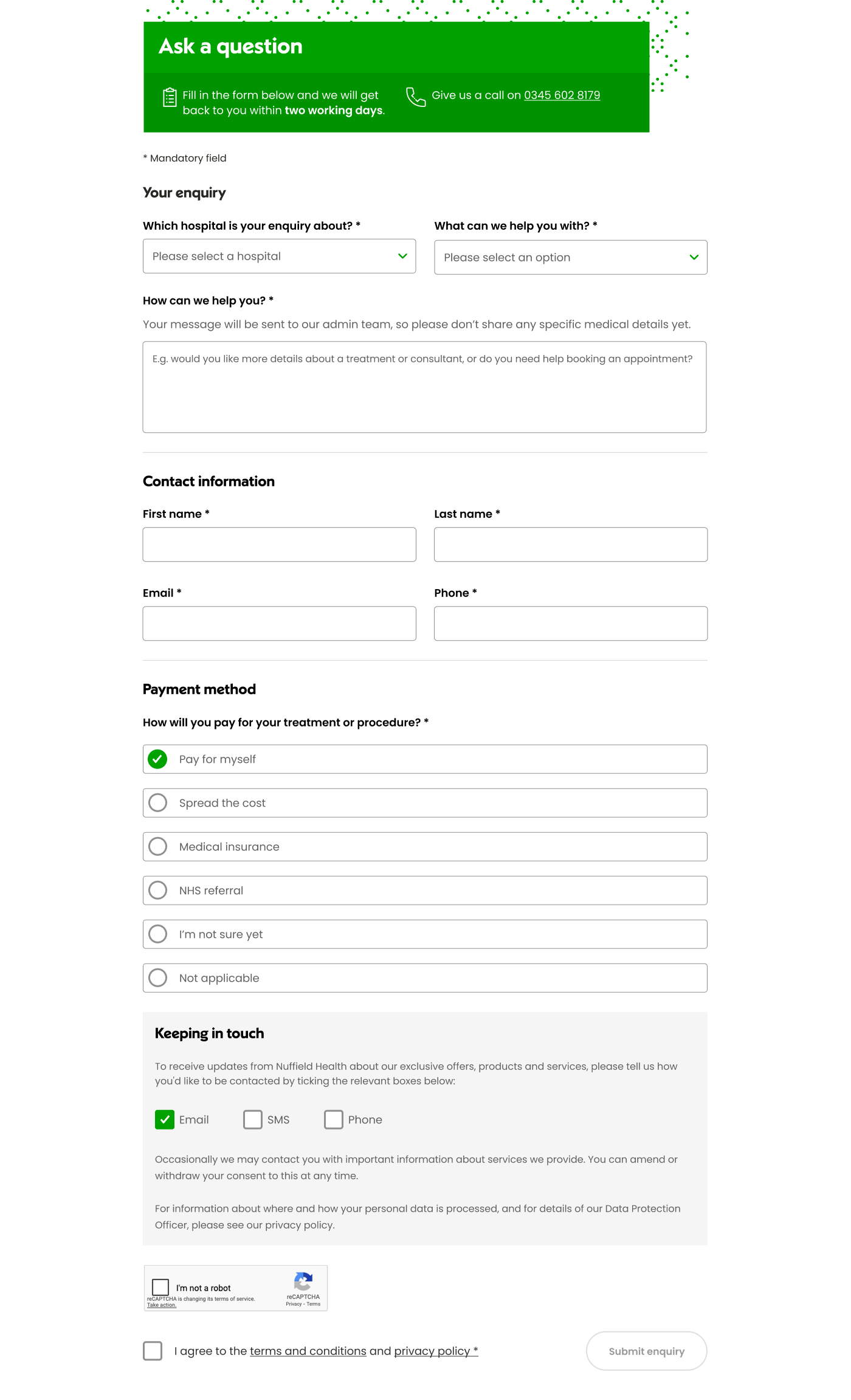
Hospital webforms were receiving a high volume of enquiries from users who didn’t necessarily need to contact the customer service team.
In many cases, people were trying to complete tasks that could already be done elsewhere online, such as finding hospital information, managing an appointment or booking directly with a consultant.
The challenge was to improve the experience so users could identify the right route earlier, self-serve where possible, and only submit an enquiry when they genuinely needed support.
We set an ambitious target: Reduce hospital webform enquiries by 30%.
I worked across the project from understanding the existing journey through to designing, testing and iterating improvements.
My UX/UI responsibilities included:
The webform had effectively become a catch-all route.
Users arriving with very different intentions were being funnelled towards the same contact experience, even when there was a faster digital route available.
This created two problems.
For users, it meant unnecessary form filling and potentially waiting for a response when they could have completed their task immediately.
For the business, unnecessary enquiries increased demand on customer service teams and reduced their capacity to support customers who genuinely needed assistance.
The opportunity wasn’t simply to make the form easier to complete.
It was to ask:
Does the user actually need to complete this form at all?
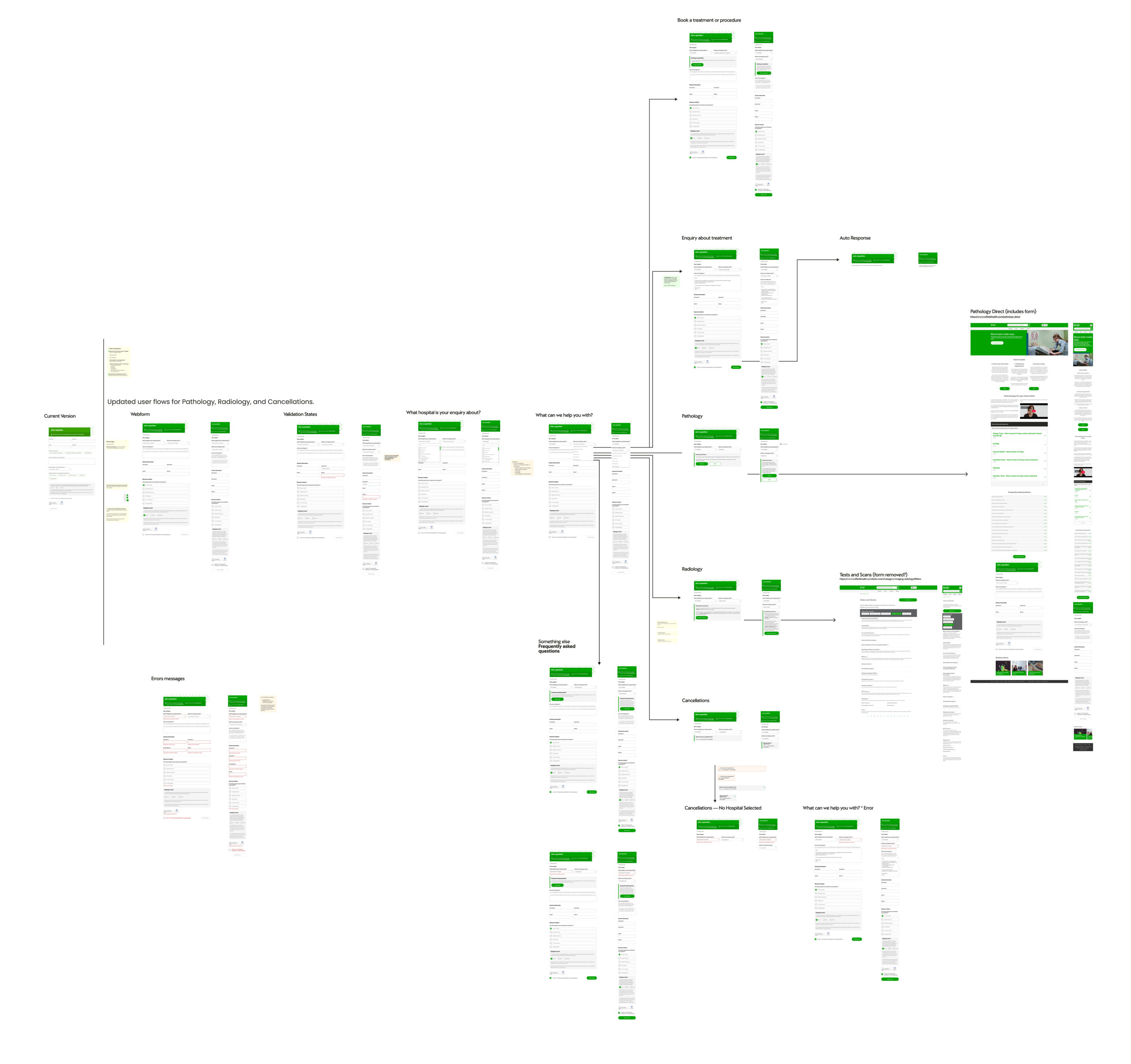
The redesigned experience provided clearer pathways for common hospital tasks, including:
Rather than presenting the webform as the obvious next step, the experience helped users understand their options before submitting an enquiry.
This reduced unnecessary effort while still keeping support accessible.
Rather than redesigning everything in one release, we took an iterative optimisation approach, introducing three rounds of improvements between December and June.
Each iteration allowed us to understand how changes affected user behaviour before making further improvements.
The UX strategy focused on three principles:
1. Understand intent earlier
We looked at why users were reaching the webform and identified common tasks that could be completed through existing digital journeys.
2. Make self-service routes clearer
Where a more appropriate online route existed, we surfaced it more prominently so users didn’t automatically default to contacting the hospital.
3. Keep contact available when users genuinely needed it
The objective wasn’t to prevent people from contacting Nuffield Health. It was to make sure users could choose the most appropriate route for what they were trying to accomplish.

One particularly interesting finding emerged after release.
Revenue generation wasn’t an original objective of the project.
However, by making the route to online consultant booking clearer, more users moved directly into that journey rather than submitting a general enquiry.
It demonstrated how improving UX can simultaneously reduce operational demand and create commercial value.
The original target was to reduce hospital webform enquiries by 30%.
The final result was: 46% reduction in webform enquiries
Alongside the reduction in enquiries, the improved consultant-booking pathway generated an estimated:
The project therefore delivered value on three levels:
Customer — clearer journeys and less unnecessary form filling.
Operational — fewer avoidable enquiries reaching customer service teams.
Commercial — more customers finding and using the online consultant-booking journey.
One of the biggest lessons from this project was that high-impact UX improvements don’t always require large-scale redesigns.
Webforms can easily become an overlooked part of a digital experience, but they sit at an important point between user intent, self-service and customer support.
By understanding why people were contacting us, rather than simply optimising how they completed the form, we were able to address the underlying problem.
The project reinforced the importance of combining user-centred design, behavioural data, iterative delivery and close collaboration with engineering and stakeholders.
Sometimes a relatively small change to the right part of a journey can create a disproportionately large impact.
46%
Reduction in hospital webform enquiries
30%
Original reduction target
£1.12m
Potential annual revenue from additional consultant bookings
3 iterations
Released and measured between December 2025 and June 2026