Multi-Brand Design System (2025 and Beyond)
Design system
Design system
This case study initiates the development of an evolving, multi-brand design system and style guide—engineered for scale, consistency, and adaptability across 2024 and beyond.
Envisioned as a living document, the system was launched with strong foundational principles and will continue to evolve alongside our digital products, design standards, and branding strategies.
The migration to a new CMS and Tailwind CSS–based front-end framework presented the perfect opportunity to establish a centralised design system—a consistent, reusable foundation across all brands. This empowers design, development, and content teams to deliver cohesive, high-performance, brand-specific experiences at scale.
The customer’s digital ecosystem is built on a Tailwind CSS–based front-end framework and a bespoke multi-brand design system, supporting brands including:
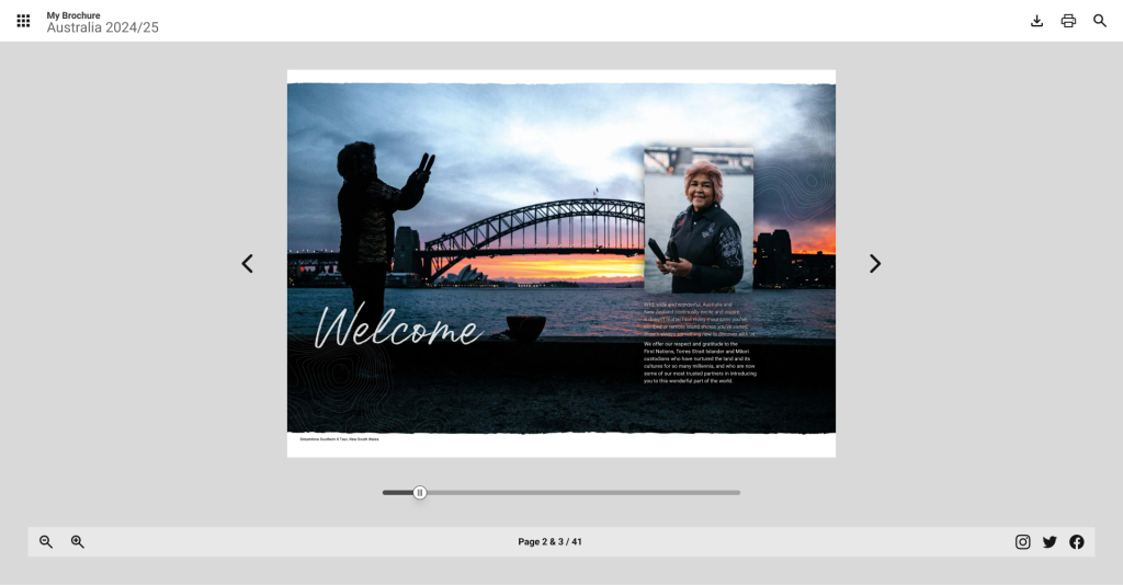
Contiki
Trafalgar
Costsaver
AAT Kings
Insight Vacations
…with more to follow.
This architecture enables brand-specific customisation while maintaining a shared, scalable core across all implementations.
All components follow an atomic hierarchy—from atoms to molecules, organisms, and templates—allowing modular, reusable, and testable building blocks across the ecosystem.
Using Tailwind’s utility-first approach allowed us to:
Ensure consistency with design tokens.
Reduce bloated CSS by minimising overrides.
Accelerate development cycles.
We developed a shared token system, where:
A core base theme underpins all brands.
Brand-specific tokens override visual attributes like colour, typography, and spacing.
Custom identities remain distinct, yet technically unified.

A vanilla/unbranded style guide in Figma serves as the source of truth.
Design tokens—colours, typography, spacing—are managed via Figma Local Variables. These tokens are then dynamically themed across brands, ensuring design alignment with the dev system.
This approach reduces file duplication and speeds up onboarding for new brands and components.
Configuration variables within the system architecture are used to tailor components for various brands.

A key innovation of this system is the Magic Picker, a visual interface within Umbraco CMS that empowers non-technical users to:
Apply and preview brand styling instantly.
Update component styles without writing any code.
Select from Tailwind-compatible token values like colour, font sizes, spacing, and more.
All styles are mapped to JSON files—updatable via Git, reflected across:
CMS styling options.
Figma component themes.
Live site outputs.
This setup allows real-time updates, seamless theming, and scalable maintenance across a growing list of brands.
The Design System (DS) library includes:
On-Page Components: Editable building blocks for content editors.
Built-In Components: Full sections designed for content editing.
Modules – Groups of elements serving a defined function.
Elements – Basic UI units with minimal logic or style.
Layouts: Reusable layout patterns structured around an 8px spacing system (8, 16, 24px, and beyond).
Each is presented in:
Alphabetical order for quick navigation.
With default CMS controls previewed alongside Figma mockups.
Branded and unbranded variants (as applicable).
Tailwind-Based Component Library and Design System
Neutral, unstyled components are used as the design system’s starting point before brand identities are layered on.
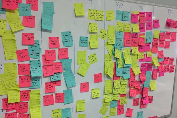
To validate component use at scale, we created a key Contiki benchmark page that displays components in situ and connects to the centralised component library. This work was carried out in collaboration with the Contiki team and the TTC Tech Design Team, who together helped shape the page structure and its implementation.

Worked on the key pages using components from the Tailwind-Based Component Library and Design System
As the ecosystem grows, we plan to:
Expand brand token management with accessibility baked in.
Integrate component usage analytics.
Extend the system to other channels (mobile, email, commerce).
Build out more sophisticated layout-level theming tools.
This design system is just the beginning—a scalable foundation built not only to deliver today, but to evolve continuously.
Tailwind-Based Component Library and Design System Neutral, unstyled components are used as the design system’s starting point before brand identities are layered on.