Gym Location Page Redesign
Improving Pricing Visibility, Navigation & Conversion
Improving Pricing Visibility, Navigation & Conversion
While working on improvements to the “price per day” messaging, I took a step back to review the Gym Location Page experience more holistically. This page plays a critical role in the membership consideration journey, yet key commercial information — especially pricing — was difficult to access once users scrolled past the hero.
The goal was to improve pricing discoverability, reduce friction in plan comparison, and increase conversion through layout optimisation, clearer CTAs, and stronger navigation patterns.
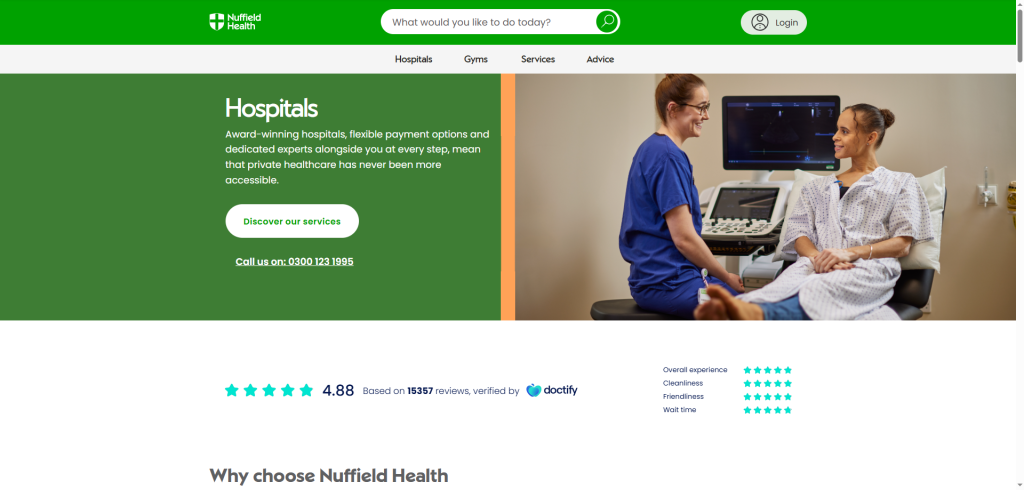
On the existing gym page:
Pricing was only visible in the top header
As users scrolled, price context was lost
Users had to manually search for membership plans
Key components felt visually inconsistent and under-optimised for clarity
Behavioural data suggested drop-off before pricing engagement
This created unnecessary friction at a critical decision-making moment.
If pricing is made more persistent, accessible, and scannable — through sticky navigation, anchor CTAs, and improved component layout — users will more easily find, compare, and understand membership options, leading to stronger engagement and improved conversion.
Using Adobe Analytics and Microsoft Clarity, I reviewed:
Scroll depth
CTA interaction rates
Engagement with pricing and membership sections
Drop-off patterns before conversion
Users frequently missed pricing when scrolling
Interaction clustered around above-the-fold content, even though pricing intent remained high
Pricing interest existed — but visibility and access were the blockers
This validated the need to surface pricing persistently rather than expecting users to search for it.
I explored multiple layout and interaction models, including:
Persistent pricing bars
Pricing-led hero layouts
Anchor-driven navigation patterns
Modal and off-canvas concepts for amenities
Component-level UI refinements for clarity and scannability
The design direction narrowed to two strong options:
Page leads with the membership price
Strong upfront price anchoring
Reinforces affordability and transparency
Hero includes “View Membership Options”
Clicking scrolls users directly to the Membership Plans section
Preserves storytelling while improving pricing access
Both options were designed to reduce friction and accelerate decision-making.
A sticky navigation bar appears on scroll, displaying:
Entry price point
Key page categories
Anchor links to major sections
This ensures pricing remains visible throughout the journey, preventing context loss.
A prominent CTA allows users to jump directly to Membership Plans, reducing scrolling effort and improving findability.
Impact: Faster access to commercial information → lower friction → stronger conversion intent.
I refined existing UI components with:
Improved spacing and hierarchy
Stronger typography clarity
Minor styling adjustments to improve readability, scanability, and brand alignment
Small UI improvements were treated as high-impact conversion optimisations.
I explored modal and off-canvas drawer patterns for amenities:
Clicking an amenity opens contextual content
Users can view details without leaving the page
Reduces navigation breaks and supports faster exploration
This concept lays groundwork for future interaction upgrades.
Pricing is always visible
Users can reach plans faster
Reduced cognitive load when comparing memberships
Cleaner, more modern UI with improved clarity
Increased pricing engagement
Reduced friction in membership evaluation
Higher likelihood of conversion uplift
Stronger alignment between user intent and commercial content
This project highlights my approach to:
Data-driven UX decisions
Using analytics and heatmaps to validate hypotheses
Applying CRO thinking to UI and layout improvements
Balancing quick-win UI enhancements with longer-term interaction innovation
Designing with a focus on business impact, usability, and scalability