Hospital Page Optimisation (2026)
Using product strategy, experimentation and behavioural insights to evolve hospital pages into decision-support experiences
Using product strategy, experimentation and behavioural insights to evolve hospital pages into decision-support experiences
The hospital landing page was one of the highest-traffic entry points for patients researching hospitals, consultants and treatments. While the page contained comprehensive information, behavioural analytics showed that users often made decisions quickly, engaging with only a small proportion of the available content before progressing or leaving the journey.
Rather than immediately redesigning the page, I began by understanding the underlying problem through analytics, behavioural data and journey analysis.
This revealed that the challenge wasn’t simply content placement or visual hierarchy. The product experience was optimised primarily for helping users find a hospital, rather than helping them decide whether it was the right hospital for their healthcare needs.
This shifted the project from a UX optimisation exercise into a broader product strategy initiative focused on improving decision support through continuous experimentation.
Instead of asking:
“How do we improve this page?”
The question became:
“How might we help patients make confident healthcare decisions while increasing engagement across the wider healthcare journey?”
This reframed success beyond page-level metrics towards improving user confidence, progression and overall journey performance.
Experiment Governance – Worked with stakeholders throughout the six-week A/B test, helping ensure decisions were based on statistically meaningful results rather than reacting to early fluctuations in performance.
By redesigning the page based on behavioural insights, improving content hierarchy, surfacing key differentiators earlier, and creating clearer pathways into relevant journeys, users would be able to find the information they need more quickly, feel more confident in their decision-making, and be more likely to take the next step.
The goal wasn’t simply to increase conversions, but to help users make better-informed decisions and engage more meaningfully with the services available.
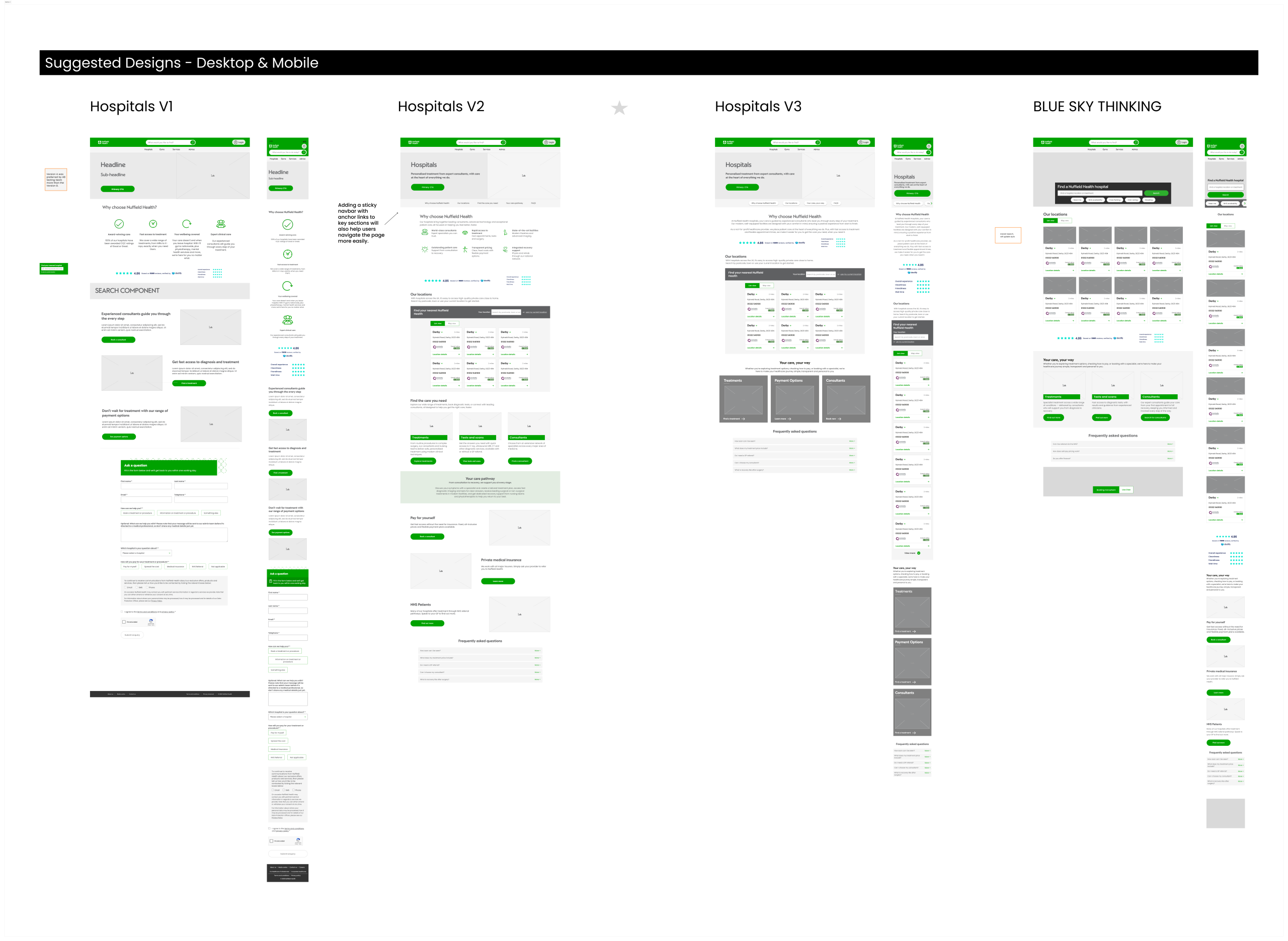
Using behavioural analytics, journey analysis and existing research, I identified several opportunities.
Users were:
Rather than solving each problem individually, I looked at the experience as part of the wider healthcare product ecosystem.
This allowed us to identify opportunities that could be validated through an ongoing test-and-learn programme rather than one large redesign.
The strategy is centred around three themes.
Help patients evaluate hospitals rather than simply locate them by surfacing expertise, facilities and key differentiators earlier.
Present the most important information in a clearer hierarchy, reducing the effort required to understand the offer.
Design flexible page patterns that could be tested, measured and iterated over time rather than creating a fixed solution.
Rather than launching a complete redesign, the work followed a hypothesis-led experimentation approach, with each opportunity prioritised and measured against clear success criteria.
Trust Signals
Hypothesis: Surfacing reassurance, clinical expertise and hospital credentials earlier will increase user confidence and engagement.
Measured by: Scroll depth, interaction with trust content and onward journey progression.
Content Hierarchy
Hypothesis: Prioritising the most valuable information higher on the page will help users find key content faster and reduce drop-off.
Measured by: Bounce rate, time on page, scroll depth and content engagement.
Navigation & Journey Flow
Hypothesis: Clearer pathways between hospitals, consultants and treatments will reduce friction and encourage users to continue their journey.
Measured by: Click-through rates to consultant, treatment and booking journeys.
Value Proposition
Hypothesis: Highlighting each hospital’s key differentiators earlier will help users make more informed decisions.
Measured by: Engagement with USP content and progression through the healthcare journey.
Calls to Action (CTAs)
Hypothesis: Simplifying and making next steps more prominent will increase progression towards booking and enquiry journeys.
Measured by: CTA click-through rate and conversion to downstream journeys.
Continuous Test & Learn
Each experiment generated new behavioural insights that informed the next set of hypotheses, creating an ongoing optimisation cycle rather than a one-off redesign. This ensured decisions were driven by evidence, allowing the product to evolve through continuous learning and measurable improvements.
Every design decision is aligned with measurable product outcomes.
Build Trust Earlier
Reduce uncertainty before users begin evaluating hospitals.
Support Better Decisions
Present information that helps patients compare options rather than simply consume information.
Reduce Cognitive Load
Simplify navigation and prioritise the content most likely to influence decision-making.
Design for Learning
Create modular components that could be tested, measured and iterated over time.
Rather than viewing experimentation as validation of a final design, testing became part of the product development process.
Several concepts were explored, including:
Each concept was prioritised based on expected user value, business impact and implementation effort before entering the experimentation backlog.
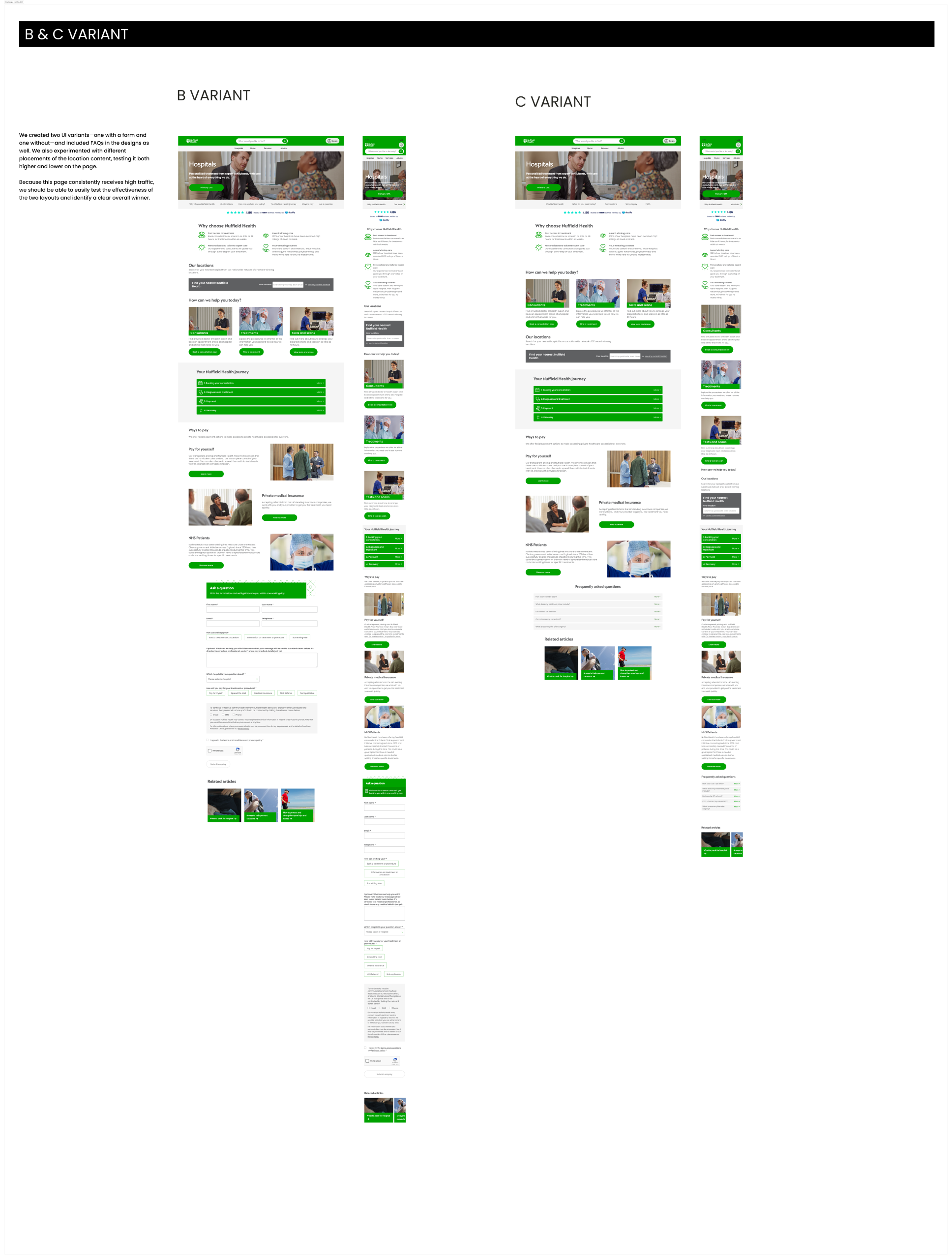
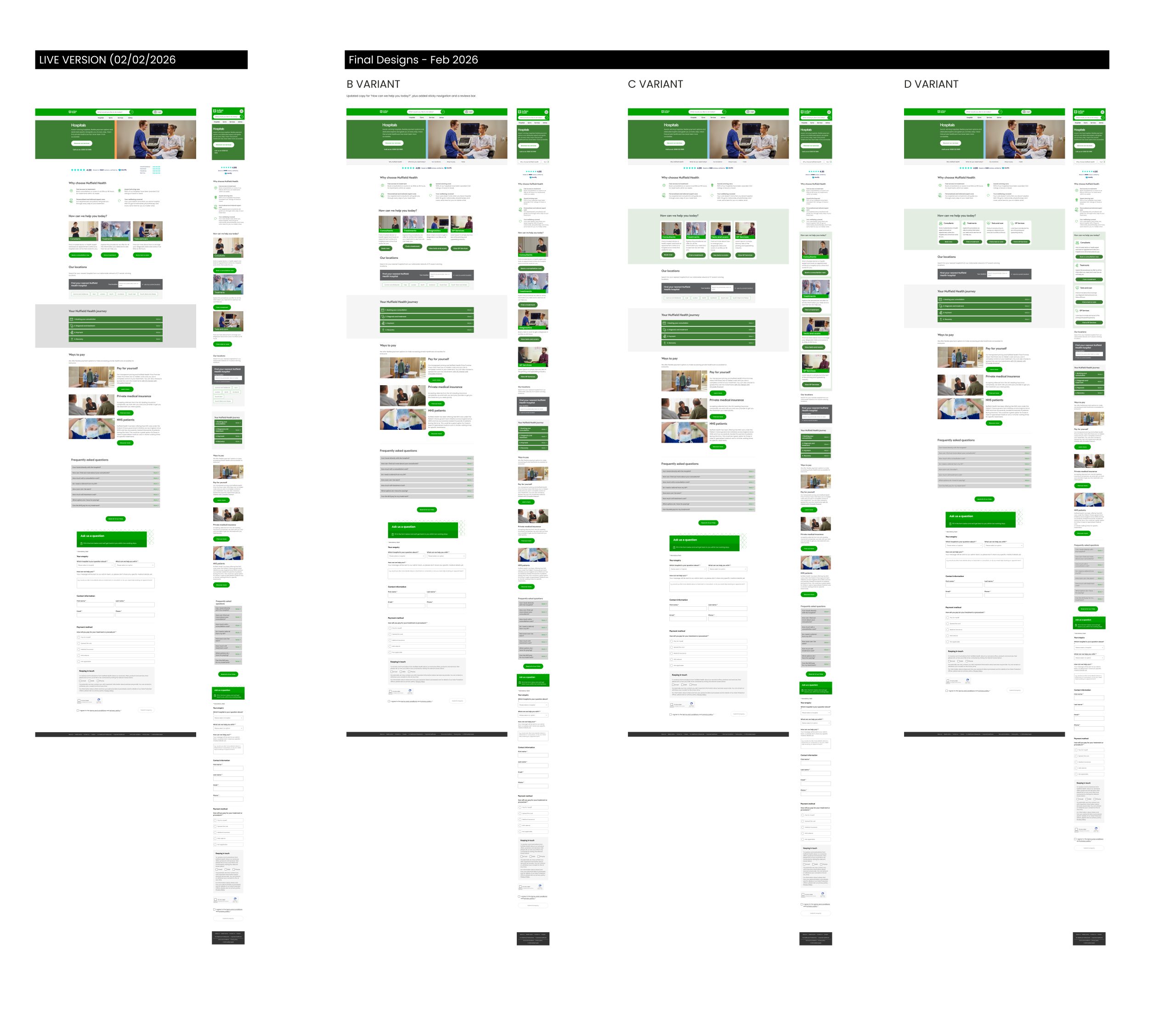
The proposed direction was validated through a six-week A/B test that measured the impact of the redesigned content hierarchy, trust signals, and navigation patterns on user behaviour.
During the first two weeks, results appeared largely neutral. Rather than reacting to the initial data, I worked closely with stakeholders to reinforce the importance of allowing the experiment to run for its planned duration.
Early A/B test results can fluctuate due to sample size, user behaviour and natural variation. Making decisions too early risks optimising for short-term noise rather than meaningful behavioural trends.
As the test matured, the performance of the variant became more consistent and ultimately outperformed the control across several key behavioural metrics.
The winning variant demonstrated:
While commercial sensitivity prevents sharing exact figures, the results validated the core hypothesis that helping users make more informed healthcare decisions improved both user engagement and business outcomes.
Beyond the outcome itself, the experiment reinforced the value of a test-and-learn approach, with insights feeding directly into the next iteration of hypotheses and optimisation opportunities.
Improve Service Discovery & Journey Progression
Make it easier for users to discover relevant healthcare services by surfacing clearer pathways to consultants, treatments, tests and private GP services. Reducing friction between related journeys helped users progress more naturally towards the information and services they needed.
Rather than treating the experiment as the end of the project, the findings informed future iterations.
The work required close collaboration across Product, UX, Content, Analytics and Healthcare stakeholders to ensure experiments balanced user needs, commercial objectives and technical feasibility.
Rather than presenting design solutions, discussions focused on hypotheses, measurable outcomes and prioritising opportunities that delivered the greatest value.
The project shifted the conversation from redesigning a page to evolving a product experience through continuous optimisation.
By combining analytics, behavioural insights and structured experimentation, the hospital landing page became a platform for ongoing learning rather than a one-off redesign.
The work demonstrated how a hypothesis-led product strategy can improve both user confidence and business outcomes, while establishing a scalable experimentation framework that continues to inform future optimisation opportunities.